Designing seamless digital experiences across app, website,
and EDM.
Complete website re-development working alongside development company Bluerock. Concept and design by myself and senior graphic designer. See https://www.madmex.com.au
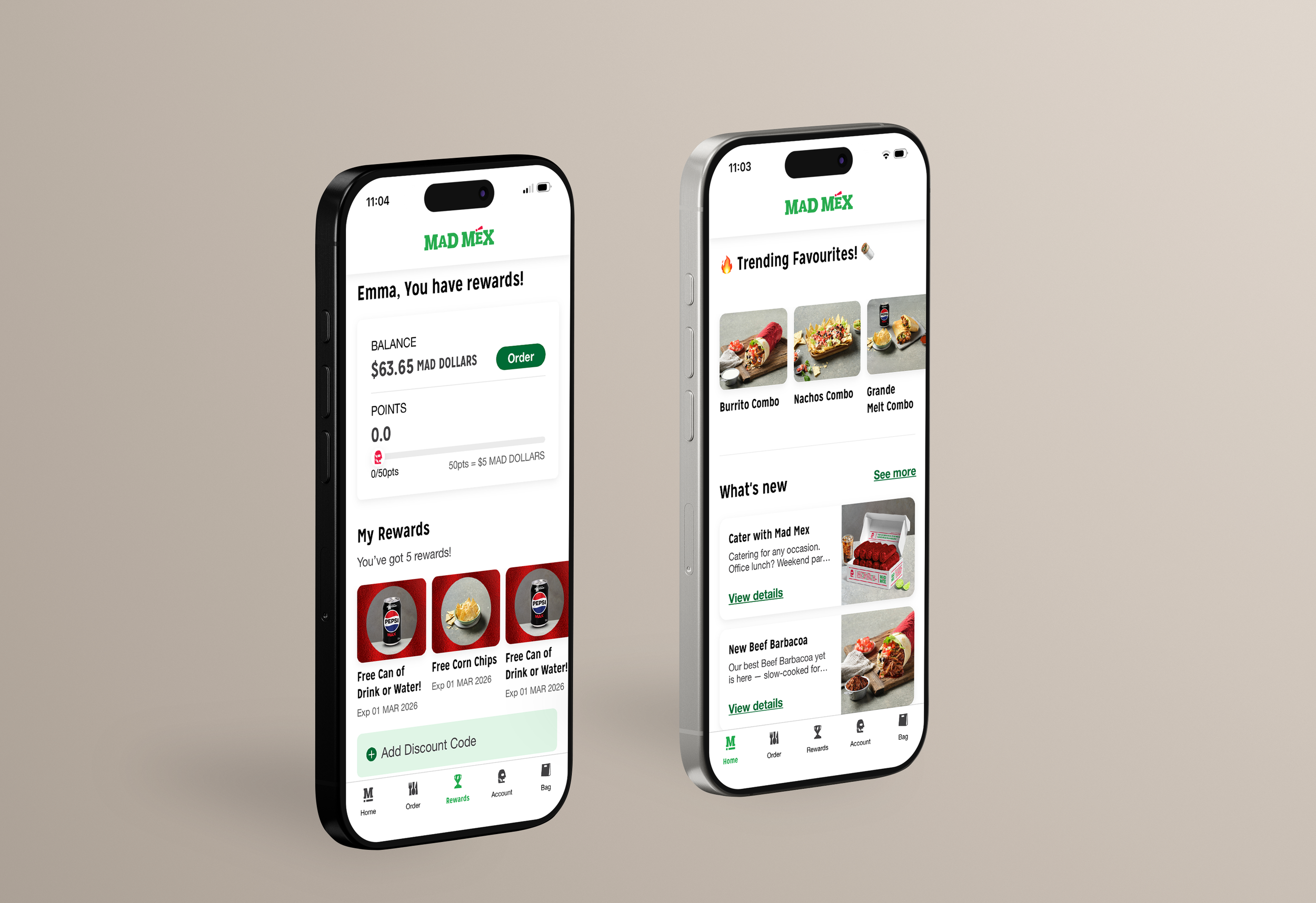
Download theMad Mex App
The creation of the Mad Mex app was a strategic digital transformation project delivered in close collaboration with TASK (development partner) and Senior Graphic Designer, ensuring a seamless balance between technical functionality and elevated brand design.
The project involved end-to-end app development, from initial concept and feature scoping through to launch and optimisation. Working cross-functionally, we aligned business objectives with customer needs to create a user-centric mobile experience that streamlined ordering, loyalty integration, and personalised offers.
The result was a modern, scalable mobile platform that elevated the Mad Mex digital ecosystem; enhancing brand perception, driving customer loyalty, and delivering a premium QSR mobile ordering experience grounded in strong UX/UI foundations.
What You'll LearnEDM’s
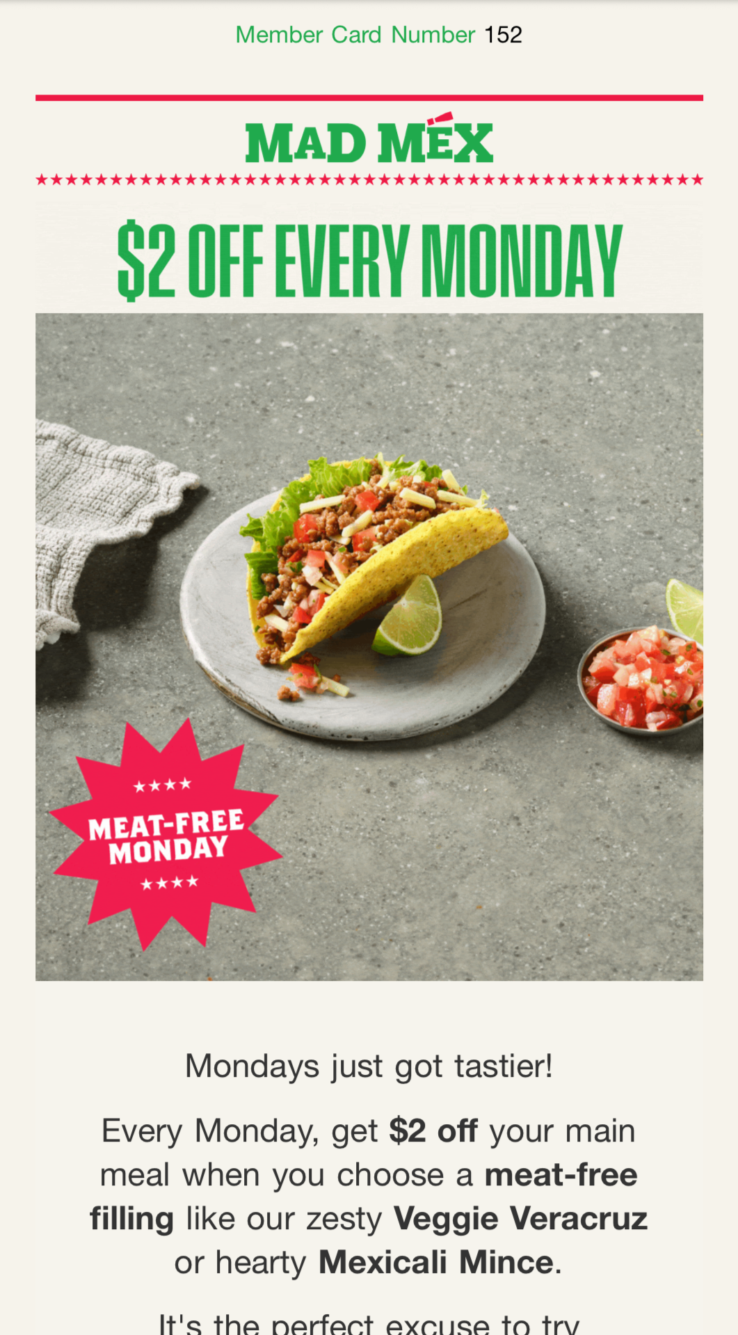
The previous EDM approach was desktop-first, cluttered, and lacked a clear hierarchy.
Layouts were built wide and then compressed for mobile, resulting in:
Small, hard-to-read typography
Multiple competing CTAs
Overloaded imagery
Long blocks of copy
The design prioritised fitting information in rather than guiding the user.
There was no clear primary action, and the visual flow didn’t support conversion.
User experience felt:
Complicated
Inconsistent
Hard to scan
Not optimised for thumb interaction
Performance reflected this — low engagement and unclear click pathways.
Learnings
This project demonstrated that strong systems drive stronger outcomes. By introducing a modular Canva-first template for the CRM team — with swappable content blocks for copy, codes, links, CTAs, and imagery — we reduced reliance on InDesign and removed production bottlenecks. Shifting from an InDesign-first to a Canva-first workflow significantly improved speed, collaboration, and feedback loops, enabling faster campaign rollout while maintaining brand consistency. The biggest learning was that improving process and empowering teams can have as much impact as the creative itself.
Before
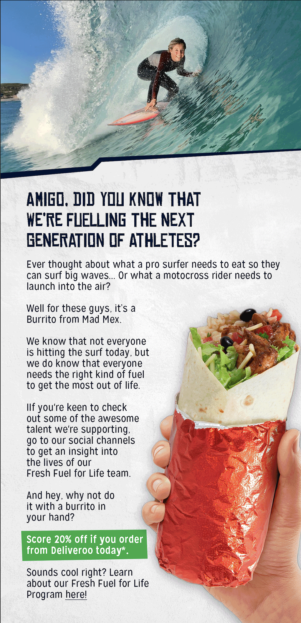
The redesign introduced a mobile-first, UX-led approach focused on clarity and conversion.
Key improvements included:
Single, clear objective per EDM
Strong visual hierarchy (Headline → Supporting copy → CTA)
One dominant, high-contrast CTA button
Short, benefit-led copy
Clean white space and structured layout
Tap-friendly button sizing (44px+)
Consistent branded UI system (typography, colour, imagery)
I implemented:
Simplified user flows
Scannable content structure
A/B testing on subject lines and CTA language
Image optimisation for faster load times
The result was a streamlined, intuitive email experience designed for real user behaviour — improving readability, click-through rates, and overall campaign performance.
After